Introduction
Interior design is an art that requires a keen eye for aesthetics and a sense of comfort. However, even with the best intentions, it’s easy to make mistakes. Here are some common pitfalls to avoid in interior design.
1. Overcrowding Your Space
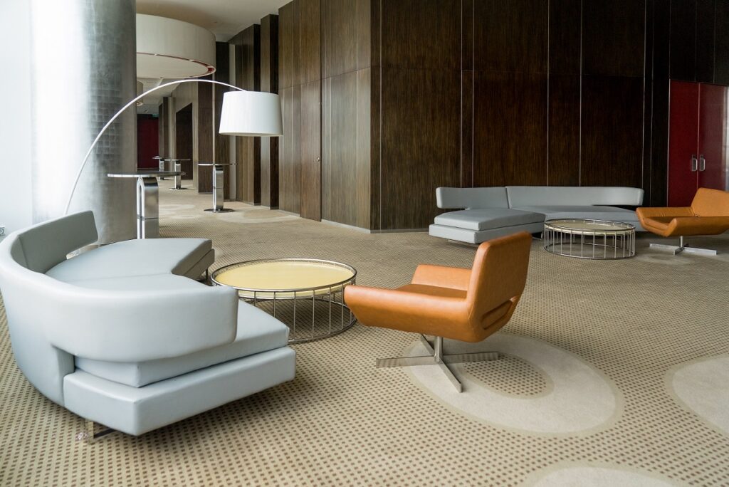
While it’s important to furnish your rooms, overcrowding can make a space feel small and chaotic. Ensure there’s enough room to move around comfortably. Remember, less is often more in design.
2. Ignoring Scale and Proportion
Furniture and decor should be in proportion to the room and each other. A large sofa in a small room or tiny art on a large wall can feel out of place.
3. Overdoing Trends
While it’s fun to incorporate current design trends, overdoing it can make your space feel dated quickly. Use trends sparingly and focus on timeless pieces that you love.
4. Neglecting Lighting
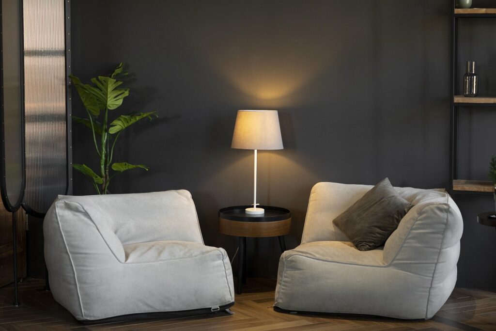
Lighting sets the mood of a room. Relying solely on overhead lighting can create harsh shadows. Consider using a mix of task, ambient, and accent lighting.
5. Matching Everything
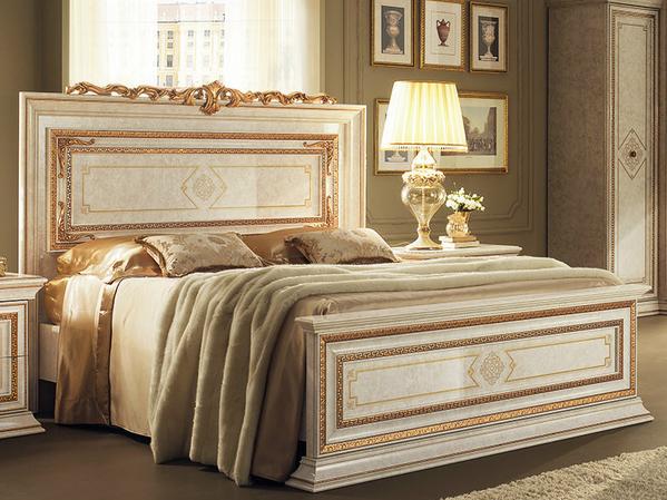
While coordination is key, rooms where everything from furniture to accessories matches can feel flat. Don’t be afraid to mix textures, colors, and styles.
6. Forgetting About Function
Design isn’t just about aesthetics; it’s also about function. Make sure your space is practical and suits your lifestyle.
7. Not Testing Paint Colors
Colors can look different depending on lighting and surrounding furnishings. Always test paint colors on your walls before committing.
8. Hanging Art Incorrectly
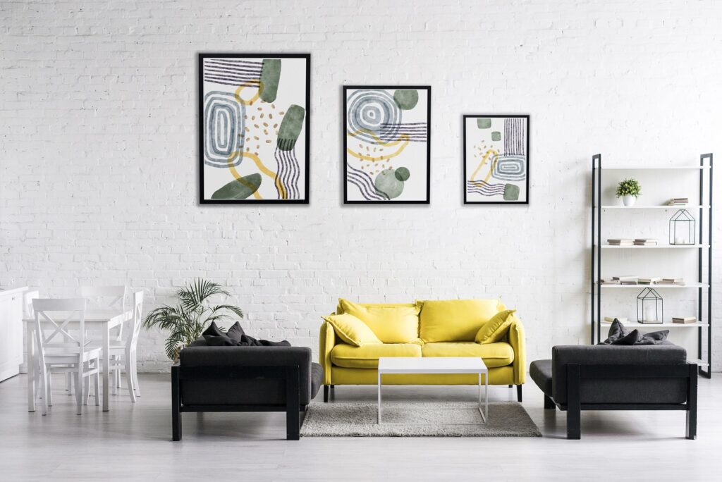
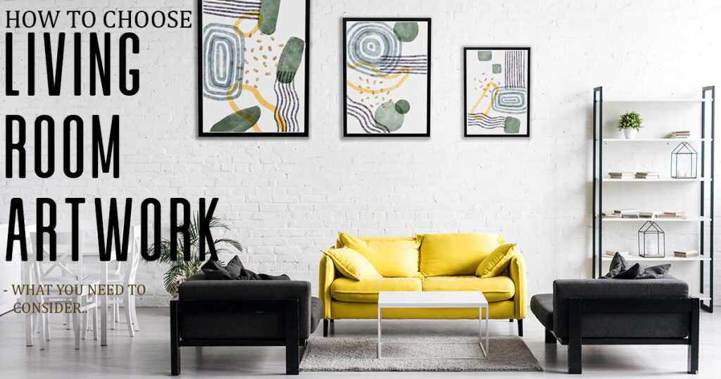
Art should be hung at eye level and proportionate to the wall space and furniture around it. Too high, too low, or the wrong size can throw off a room’s balance.
Conclusion
Avoiding these common interior design mistakes can help you create a space that is both beautiful and functional. Remember, the best-designed spaces reflect the people who live in them, so don’t be afraid to let your personality shine through.


